- By passing light through a prism that refracted or bent the light rays into a spectrum of colours.
- Colour is contained in light and it does not exist in the absence of light.

Pantone Colour System
- The pantone colour system is used by many professionals in fashion and in other industries in which colour accuracy is important.
- Pantone forecasts fifty six colour trends each year, which are then used by companies producing products like clothing, home furnishing, automobiles and paints.
- Marketing in a “fan” pantone colour trends serves as a visual reference for designers.
- Among their many colour services, they provide computerized colour selection services on the internet, a matching system that facilitates reproduction of colour among companies.

- A color wheel is disk-shaped and divided equally into 12 sections.
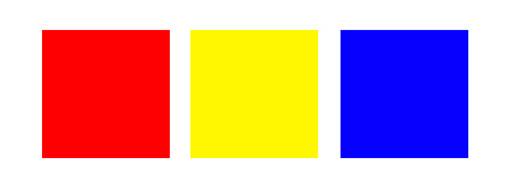
- All colors arise from the three primary colors: red, blue and yellow. These colors are primary because you cannot make them by mixing other colors together.
- Mixing equal values of any two primary colors together creates the secondary colors of violet, orange and green.
- Mixing equal values of any two secondary colors secondary colors tertiary colours.

The three primary colours are red, yellow and blue. These are the base
Secondary Colours
Mix two primary colours together and you’ll get a secondary colour.

Mix together a primary and a secondary and you’ll end up with a tertiary colour.
Warm and Cool Colours
The colour wheel is divided into two halves, warm and cool colours. Generally speaking warm colours are more upbeat and energetic, while cool colours are calmer and more soothing.
Examples of warm colours are orange and yellow. Whereas examples of cool colours are blue and green.

It creates an over all mood for the painting or illustration.
Natural mood includes earthy shades like greens browns…
Colour applications
Colours are also used in real world other than painting and illustrations.
Interior design, house hold appliances.

It is a range of various tints and shades of particular colours, obtained by adding white or black to the colour.

A complimentary colour scheme is a selection of two colours from each end of the wheel, for example red and green. Despite the word complimentary, they look pretty terrible if used together.

Analogous Colours
Analogous colours are colours that appear next to each other on the wheel. Taking a colour scheme of analogous colours is a great start to any design, as they harmonize really well.

Triadic Colours
As you might guess, triadic colours take three samples from the colour wheel that are equally spaced. Triadic colours are quite vibrant, and often troublesome to work with due to their high contrast.

Split Complimentary Colours
As with complimentary colour schemes, a split complimentary takes samples from opposite ends of the colour wheel, but with the split not being directly adjacent, there’s less contrast and tension. 
- A tint is when white is added to the colour, making it increasingly lighter.

- Shades are when black is added to the colour, and produces darker versions of the colour.

- Tones are when grey is mixed with the colour, which takes away the colour value making it more neutral.

Value scale: A series of spaces filled with the tints and shades of one color, starting with white or the lightest tint on one end, and gradually changing into the darkest shade or black on the other.

Grey scale: The range from white through gray to black.

Hi Monika...Plzzzz share wid us abt fashion illustration in future..
ReplyDelete