Monday, December 6, 2010

Colours

What is a colour?
  • By passing light through a prism that refracted or bent the light rays into a spectrum of colours.
  • Colour is contained in light and it does not exist in the absence of light.


Pantone  Colour System
  • The pantone colour system is used by many professionals in fashion and in other industries in which colour accuracy is important.
  • Pantone forecasts fifty six colour trends each year, which are then used by companies producing products like clothing, home furnishing, automobiles and paints.
  • Marketing in a “fan” pantone colour trends serves as a visual reference for designers.
  • Among their many colour services, they provide computerized colour selection services on the internet, a matching system that facilitates reproduction of colour among companies.


Colour Wheele
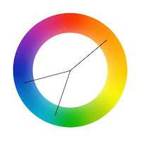
  • A color wheel is disk-shaped and divided equally into 12 sections.
  • All colors arise from the three primary colors: red, blue and yellow. These colors are primary because you cannot make them by mixing other colors together.
  • Mixing equal values of any two primary colors together creates the secondary colors of violet, orange and green.
  • Mixing equal values of any two secondary colors secondary colors tertiary colours.


Primary Colours
The three primary colours are red, yellow and blue. These are the base

Secondary Colours
Mix two primary colours together and you’ll get a secondary colour.

Tertiary Colours
Mix together a primary and a secondary and you’ll end up with a tertiary colour.

Warm and Cool Colours
The colour wheel is divided into two halves, warm and cool colours. Generally speaking warm colours are more upbeat and energetic, while cool colours are calmer and more soothing.
Examples of warm colours are orange and yellow. Whereas examples of cool colours are blue and green.

Colour scheme
It creates an over all mood for the painting or illustration.
Natural mood includes earthy shades like greens browns…

Colour applications
Colours are also used in real world other than painting and illustrations.
Interior design, house hold appliances.


Monochromatic colours
It is a range of various tints and shades of particular colours, obtained by adding white or black to the colour.


Complimentary Colours
A complimentary colour scheme is a selection of two colours from each end of the wheel, for example red and green. Despite the word complimentary, they look pretty terrible if used together.

Analogous Colours
Analogous colours are colours that appear next to each other on the wheel. Taking a colour scheme of analogous colours is a great start to any design, as they harmonize really well.

Triadic Colours
As you might guess, triadic colours take three samples from the colour wheel that are equally spaced. Triadic colours are quite vibrant, and often troublesome to work with due to their high contrast.

Split Complimentary Colours
As with complimentary colour schemes, a split complimentary takes samples from opposite ends of the colour wheel, but with the split not being directly adjacent, there’s less contrast and tension.


COLOUR TINTS, SHADES AND TONES
  • A tint is when white is added to the colour, making it increasingly lighter.

  • Shades are when black is added to the colour, and produces darker versions of the colour.
  • Tones are when grey is mixed with the colour, which takes away the colour value making it more neutral.                                 

Value scale: A series of spaces filled with the tints and shades of one color, starting with white or the lightest tint on one end, and gradually changing into the darkest shade or black on the other.

Grey scale: The range from white through gray to black.

Wednesday, December 1, 2010

Elements of Design

Design

  • Design refers to a plan or a skill full way of doing a sketch or drawing which is visualized and then represented for the construction of an object.


Elements of design

  • Design elements are the basic units of a visual image.
  • Line, Colour, Texture, Shape, and Form are the elements of design.
Line

  • Lines have several aspects including direction, thickness, sharpness, and length. There are two types of lines
  • Straight lines (vertical, horizontal, diagonal, zigzag), Curved lines.

Straight lines

  • They are opposite to curved lines they are rigid and crisp.
  • Each direction are straight lines creates an optical illusion.

Vertical lines

  • They generally add height or length to the body and make it look more narrow.
  • It is a favored line direction for those who wish to look taller.
  • Vertical lines repeated can add width. Closely spaced parallel vertical lines may lead the eye in upward direction. But if the space gets increased the eye may begin to measure the width.

Horizontal lines

  • They generally add width and shorten the body. They can attract attention towards one part of the body.
  • They carry the eye across the body. Horizontal lines by spacing can produce the illusion of length.

Diagonal lines

  • They always shows a movement or motion. They are slimming because they direct the eye over body curves at an angle.

Zigzag lines

  • It is a series of connecting diagonal lines. It forces the eye to shift abruptly and repeatedly. They tend to increase the size of the area covered by them.

Curved lines

  • Curves are graceful, flowing, gentle. It attracts attention and soften the area. It can even add weight to a thin person.

Colour

  • By passing light through a prism that refracted or bent the light rays into a spectrum of colours.
  • Colour is contained in light and it does not exist in the absence of light.

Primary Colours

  • The three primary colours are red, yellow and blue. These are the base.

Secondary Colours

  • Mix two primary colours together and you’ll get a secondary colour.

Tertiary Colours

  • Mix together a primary and a secondary and you’ll end up with a tertiary colour

Textures

  • It is a feel of a surface.
  • There are two types of texture
  • Visual and Tactile.

Visual texture

  • It is the way the surface of an object looks like it feels.
  • It may look rough, fizzy, but cannot actually be felt.
  • Example: ply wood.

Tactile textures

  • It is the way the surface of an object actually feels.
  • Example: sand paper, tree bark.

Shape

  • It is a self contained defined area of geometric or organic form.
  • A positive shape in a painting automatically forms a negative space.
  • It can also show perspective by overlapping.

Form

  • It is a three dimensional object.
  • It can be measured by its height, width, and depth.
  • It is also defined by light and dark.
  • There are two types of forms geometric and natural.


Principles of design

  • The principle of design (i.e. the unique arrangement of the element) is based on some aesthetic system.
  • The principles of design govern the relationships of the elements used and organize the composition as a whole.
  • The principles of design consist of:
  • Balance, harmony, emphasis, proportion, rhythm.

Balance

  • It can be either symmetrical or asymmetrical.
  • It can be achieved by the location of object, volume or size and also by colours.

Harmony

  • Harmony is achieved through the sensitive balance of variety and unity.
  • Color harmony may be achieved using complementary or analogous colors.
  • Harmony may be visually pleasing and harmony is when some of the objects like drapes.

Emphasis

  • It is dominance or a concentration of interest in one area of a design as the centre of attention.
Proportion

  • Proportion is the design principle concerned with the relation of the size of the part to the whole and to each other.
  • It includes height, width, depth, and the surrounding space of each design.

Rhythm

  • It is a pleasing sense of organized movement that gives continuity to a design.
  • Without rhythm a design may appear spotty or disconnected.
  • It is also seen in the progression, gradation, or orderly sequence of gradually increasing or decreasing changes in sizes of elements or image.